
How have Walmart.com, Nordstrom.com and CNN.com evolved to meet the changing demands of its users over the last 10 years? Some have responded with more dramatic changes than others. I enjoyed taking a look at the “way back when” website home pages I’ve been browsing for a decade in this post by Website Magazine – How 9 Well-Known Websites Looked Way Back When. Here at JD, we just celebrated our 15th anniversary, so I thought it would be fun to take a trip down memory lane to see how our home page has evolved since 2000. Join me…
2000
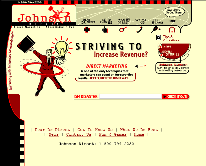
The trend-setting JohnsonDirect.com goes live. Pre-Web 2.0, this site is stocked with eye-catching animation, interactive features — like Dear Dr. Direct and Fun & Games — and playful, witty copy. The website is a direct reflection of the personality the agency portrays to its clients and prospects.
2004

You can see how we responded to users’ needs for INFORMATION. Prospects were using the Internet to pre-qualify and source agency partners. We used a variety of content types to demonstrate our marketing know-how. The end result, however, is information overload.
2008

Although this Wayback Machine view isn’t able to render our primary navigation and masthead, you can see that by 2008, we transformed our web presence to highlight our value proposition and differentiator – measurable marketing. The look is easy on the eyes and easy to navigate.
Today

With years of analytics data to guide our way, JD has evolved its website to lead prospects intuitively to the content they’re most interested in — what we do, how we’re different and what our work looks like. Our Marketing that’s Measurable Blog is where we feature our marketing know-how and advice for fellow marketers.
SHOW US HOW YOU’VE EVOLVED
How your website has evolved? Send me THEN and NOW screen shots for YOUR website. We’d love to see them and we’re sure our blog followers would, too.